This Is Nowhere: Aspects of Accessibility
Mar 12, 2019 15:01
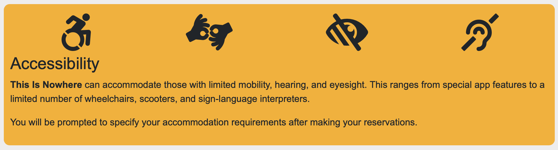
Part of the mandate for the This Is Nowhere production was to make the experience as accessible to as many people as possible - in the real world and in software. Previously, most of my accessibility experience involved following standards clearly to allow screen-readers and other tools to help people use my software. This time we went full-on, specifically adding features to enhance the accessibility of the app.
While working on this certainly didn't make me an official accessibility expert, taking the time to work with these issues gave me some surprising (at least for me) insights.
Getting Accessibility Advice Early
One of the scenes in the final production, "Inclusion" was about accessibility and able-ism, so the team at Zuppa had been in contact with local accessibility activists from very early in the planning stages for This Is Nowhere. I was able to meet with members of the community during the development process, getting valuable feedback and context for what would help the most.
When implementing accessibility features in software, it's great to not have to just guess what you'll need to support. Getting facts and feedback from people who know the situation is super valuable.
Asking About Accessibility At Registration
Because we built our own registration system, we were able to add a second page with our own accessibility questions on it. One big thing we did was set up menus with multiple options per accessibility situation. Instead of a yes/no of “I have mobility issues” there was “I am able-bodied”, “I get sore easily and would rather not walk too much”, “I use a cane/walker”, “I require a wheelchair”. Same thing with hearing and vision - not just “I am deaf” and “I am blind” but also “I have some trouble reading text” or “I sometimes can’t hear very well”. We also included a text box to let people enter any further details.
When people started signing up, I was surprised at how many people flagged one of the intermediate-level accessibility issues, like that they can’t walk too much or don’t hear or see very well. The notes showed the range of “disabilities”: recent athletic injuries, bringing a child in a stroller or a grandparent with a walker, recovering from an illness - very few of them the stereotypical image of “disabled” I had had in my head while setting this up.
So now that our audience members had told us about their accessibility needs, what did we do to help them?
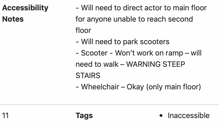
Accessibility By Location
The first thing we did was set up an “Inaccessible” tag for the location profiles. Getting locations that would work right for the show had been difficult and complicated, and it was unfortunately inevitable that some of the spots were just not going to work well for people with serious accessibility issues.
The algorithm that figures out where each audience member goes next takes into account (among other things) the current available space at each location, the distances from the participant’s current location, and any tag matches that might apply.
If you were flagged as having light mobility issues, the algorithm would pick somewhat nearer locations for you. If you had serious mobility issues, it would pick much nearer locations for you. It would also filter out any locations tagged as “inaccessible”.
So, some people weren’t going to get to see everything in the show. However, the nature of the show was that nobody was going to experience everything available. Everybody gets a different set of locations, and nobody gets them all. It would be entirely possible for a fully-mobile audience member to get exactly the same set of locations in their experience of the show as someone with mobility issues.
Not having a strict required set of experiences meant that nobody got left out - or that everybody got left out, which is sort of the same thing.
Besides the tags, we also had a text area for describing any accessibility details necessary for that location, such as alternate entrances and whether extra help might be needed. This text showed up for the site managers.
Accessibility and Content
We also added tags to the individual content items. We had “PoorHearing” and “PoorVision” and also “NotPoorHearing”. This way we could give different instructions to users depending on their particular situations. For example, several locations involved listening to headsets - something which wouldn’t really make sense for people who couldn’t hear. If people couldn’t see very well, we could explain in more detail some of the more subtle things that might be going on in a performance.
We also added the entire scripts for each location as captions, available for users who said they couldn’t hear very well. This turned the app into a “subtitles” system, simply through some content tagging.
Accessibility Tracking
During the show, the app was reporting back to the server quite frequently with status, progress, and GPS position. This let us see where everyone was from a central interface. Site managers also had mobile-friendly pages available which showed who was on their way to their location, how far away they were, how long they’d been searching, and last but not least whether they had any accessibility issues. This let managers know whether extra effort was needed - and they could even send out staff to meet anyone needing extra help while they were still on their way.
Also, the central technical support and audience management interface let me flag individual users for extra tracking - and by default it automatically added all accessibility users to that list, so I could see at a glance whether they were having any problems, and text or email them help.
Accessibility and App Features
We built accessibility into the app itself. iOS and Android already have many accessibility features built in, such as dynamically resizable fonts and higher-contrast display options. The key for supporting these is to not get in the way of the native UI, and we generally did so.
We didn’t end up having anybody with the kinds of vision issues which would require screen readers, but we did check to confirm that our UI generally worked for that.
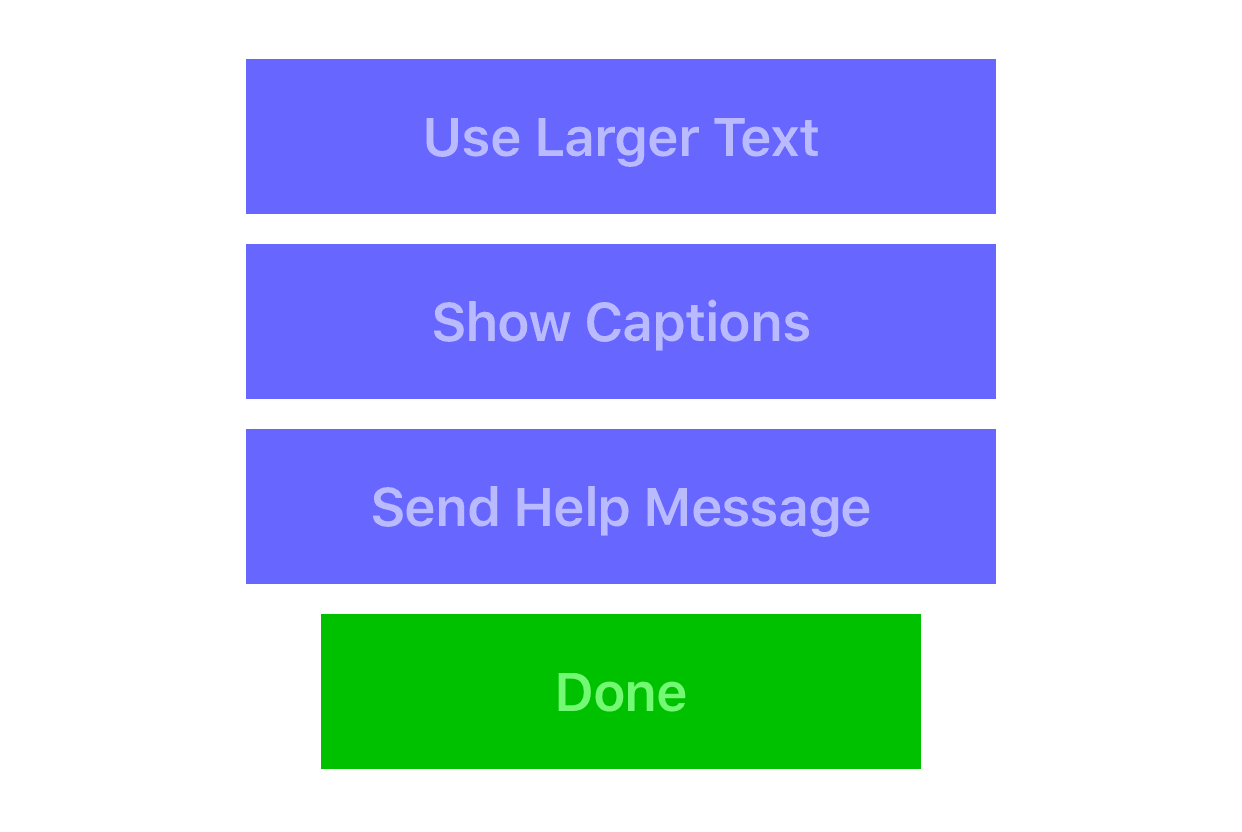
The main thing we did, though, was add a “large text” mode to the app, which used a much larger, bolder font to display content.
Funnily enough, for testing I had set up a button to turn this large text feature on and off - and once while out testing in bright mid-day summer sunlight, I found myself turning on the large text, just to make it easier to see the clues in all the sunlight.
So I ended up keeping that button, allowing anyone who wanted needed it to activate the larger text any time they wanted. I also allowed any user to turn on the “subtitles” captions
This is a key lesson about accessibility: adding accessibility features doesn’t just make things better for “special needs” users - it often makes things better for everyone. Everybody has accessibility issues sometimes.
How It Worked Out Live
The thing with doing software for a live performance is that you never really know how things are going to work until you’re actually running with a real audience. As it turned out, things on the accessibility front went pretty smoothly. People weren’t sent to inaccessible locations, and the large text and subtitles features worked pretty well.
The accessibility activists we had worked with while creating the show all decided to travel together, sharing a single device and a sign-language interpreter. We kept an eye out for them both in the real world and in the tracking software. Surprisingly, they ended up tearing through the show locations more quickly than almost anyone else. It shouldn’t have been so surprising in retrospect: as each clue came up, the device was shown to the whole team, and after a flurry of sign-language they quickly deciphered every clue. Then they zoomed in their electric wheelchairs to the destination, where they were able to read the subtitles often quicker than the performance would actually take.
In the end, we almost ran out of locations for the accessibility team!
Finally
The biggest thing I learned in this is that adding accessibility features to a project ends up helping a lot of people. It's easy to imagine the only people needing accessibility features are those in wheelchairs or with serious vision or hearing problems - but everybody has issues at various times and for various reasons, and adding features to help some people often ends up helping many more.