This Is Nowhere: The Single-Button UX
Oct 12, 2018 12:04
This is part of an ongoing series about my work on Zuppa Theatre's "This Is Nowhere" project. Here's the previous one.
For the This Is Nowhere mobile app, we knew we had the following requirements:
- It should provide clues to help you find locations
- It should know how far you are from a location and give you some sense of that without being too explicit
- When at a location, it should provide extra context for the performance
Besides the core functionality, there were some other things it needed:
- It should work on as many different kinds of device as possible, both Android and iOS, and ideally quite old ones
- it shouldn’t be intrusive, but should rather act as a companion to the main action
- anybody at any level of technical expertise should be able to start using it immediately without any extra training
- part of the project’s mandate (and funding) involved support for people with various kinds of special needs requirements
We had trial runs scheduled with the writers and other key team members, so I aimed to have at least something for them to work with. As I mentioned in my previous post, I always prefer minimally-working prototypes over mockups, so I set to work building something that would at least handle the specific requirements. I updated the server side CMS to support locations having clues and captions, which was pretty straightforward. The client side had a lot more going on.
For flexibility, this first version was done as a mobile-friendly web application, using my old friends Bootstrap and JQuery. This was a great way to start for many reasons:
- any Android or iOS device from the last decade should be able to load and run this page with basic layout and JavaScript
- new features and updates could be deployed instantly, and users just have to reload the page to get the latest version
- things like getting JSON from a server is really easy to do with JQuery and doesn’t require complex parsing techniques
- I’ve been working with Bootstrap and plain JavaScript / JQuery for many many years now, so I could focus on features and usability instead of wrestling with new programming concepts
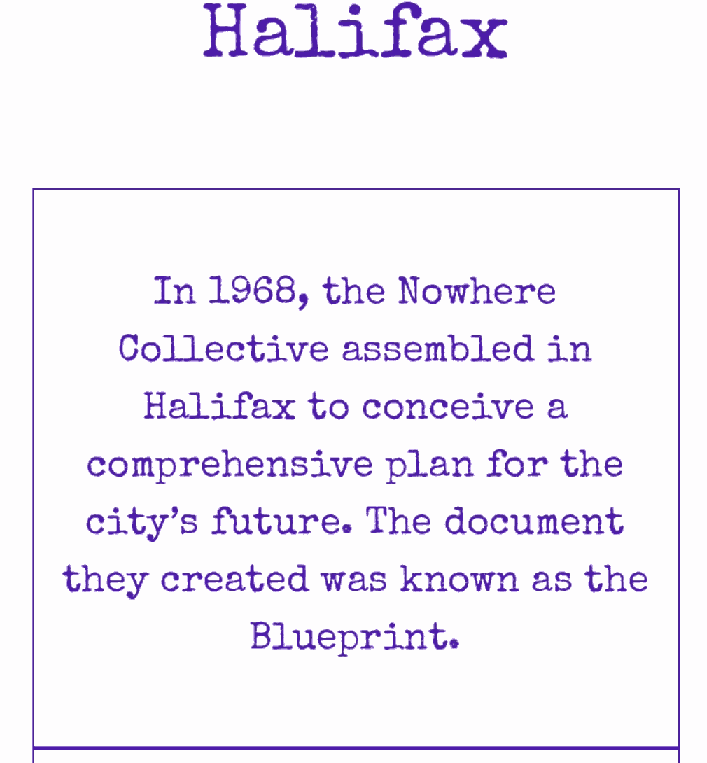
I wanted to have some kind of a distinctive look for the app, beyond just black-on-white. The evolving backstory of the show involved a manifesto written by a “Nowhere Collective” back in 1968. I’m old enough to remember back before photocopiers were ubiquitous when things like class tests and newsletters were duplicated with mimeograph / “ditto” machines - producing a distinctive purple-on-white document (and if your teacher was running late, damp paper which still smelled strongly of solvent). So I decided on a vintage typewriter font and a strong purple-on-white look. As many elements as possible would be plain typewriter text, which would be genuine to the 1968 aesthetic but also meant that I wouldn’t have to worry about fancy graphics and icons, at least at the start. I’ve always been a fan of plain text, and this context gave me the perfect excuse to use it.
The first versions of the app had the clues show and then disappear like a slideshow, but this quickly turned out to be unsatisfactory. If you missed a clue as it went by you’d be out of luck. Because of this you would have to spend all your time looking at the app, just in case something new came up. You’d also be entirely subject to the tempo of the app, regardless of what situation you might be in, such as crossing the street or watching (or even participating in) a performance.
I teach a part-time course in web development, and at this time I had recently done a unit on all the DOM manipulation methods in JQuery, such as .append() and .prepend(). Personally, I prefer to set everything up in data and then swap it all in at once with an .html() call, but here I realized I could actually use .prepend() to build a continuously building list of content, giving it a feel a little bit like Twitter or the Facebook timeline, something which many users would already find familiar. As new clues arrived, the older ones would be pushed down, but they’d all still be available for review through a simple swipe. This also easily supported longer content or larger font sizes: since it was scrollable already a single clue could stretch for more than a screen in height.
The next challenge was how to have clues triggered by timing or distance while also keeping them under the user’s control in case they were busy or distracted or otherwise overwhelmed. The solution to that was to have new clues arrive with a cover. To read the clue the user has to tap on the cover. This gives it a nice feeling of revealing a secret, but we can also have the app pause until the user actually taps on the cover to read the clue. Once they’ve tapped, we can start the timers and distance checks or whatever else to start the process of sending a new clue to them. This way the tempo of the experience is a combination of the user and the app, but in the end it’s always under the user’s control.
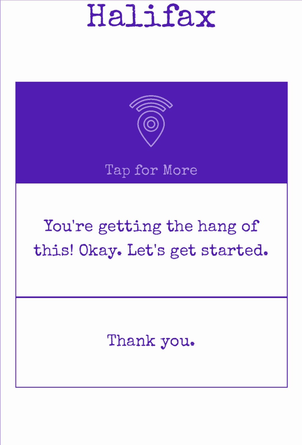
We ended up building a fairly sophisticated experience where the only thing a user has to do is tap one large button every so often. Because even that isn’t necessarily that obvious we did a few extra things:
- we added a label to the button which says “Tap For More”. This label is customizable, so when the app first starts it instead says “TAP ME” like the bottles that say “DRINK ME” in Alice in Wonderland. It then says “Thank You” and the next button label says “TAP ME AGAIN”. This is as much training as anybody needed.
- we made the button label fade in and out gently. I’ve found that a repeating pattern like this is a great way to flag something as interactive and potentially tappable.
- eventually, we added a fade in / slide down effect when the clue is revealed. The sliding down highlights the fact that the content is scrollable.
This tap-read-scroll-tap-again experience stayed as the core of the app for all of the many iterations that were to come. It seems quite simple, but as one of the actors noted after a test run, quoting Dolly Parton: “it costs a lot to look this cheap!”
Here's a video of the early version of the app in action: