Starting Up: Cards
Feb 07, 2008 12:35
Back in late 2004 / early 2005, I decided to get serious about getting some real business cards for my sole proprietorship. I wanted a strong visual statement, as well as a quick marketing pitch. Since at the time I was working in Lotus Notes, Java, and PHP, I put these items on the back of my card, including my hard-won certifications as a "Principal Lotus Certified Professional" and a "Sun Certified Web Component Developer". By mid-2005, I had discovered Ruby on Rails and haven't done new work in Java or Notes since. The Lotus certification did get me some work back in 1999-2000, but the Java certification was irrelevant within months of passing the exam.
Technology is a funny business: my contact information hasn't changed in three years; but my career focus, my language of choice, and even the importance of my certifications have all changed completely.
I continued handing out these cards - they still look great and the contact information is still valid - but always with a bit of an apology and a request to ignore the information on the back.
In starting up Shindig, I was going to need new cards. I wanted to get it right this time. Here they are:
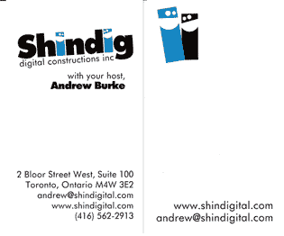
- Two colours: black and turquoise. This makes a strong statement and is easier to print.
- The logo is prominent, but not overwhelming. Someone recently pointed out that the bigger the company, the smaller the logo on their cards. Shindig hasn't already had its branding advertised to death, so I still wanted to keep it relatively notable - but it isn't crazy.
- I wanted to keep it fun, like the logo and the name. The logo is on an angle, and the dudes are highlighted on the flip side.
- I spent a lot of time thinking about my title. "Founder" was my best thought ("CEO" and "President" were a bit much, and I thought "Kahuna" or "Honcho" would be a bit too far on the whimsy scale) - and then my designer had "with your host" on one of her options and it clicked. It's not even really a job title, but it implies an attitude and a style of action. It ties in thematically with the party and variety show aspects of the name "Shindig" - and is even appropriate technically, since Shindig's main focus is hosting its business applications on the web.
- The contact information is a mail box I have at the CIBC building at Yonge & Bloor. I've moved around a lot in the last few years, but this mailbox address has been valid for over a decade now. It's a good address, and an easy location to get to even if I'm just passing through town. Likewise, the phone number is my cell phone - which also hasn't changed since 1999.
- I mostly highlighted my email and web addresses - if you can't handle web sites and email, I don't think you'll find Shindig very useful to you!
- The back of the card is mostly empty. My previous cards were pretty full, with a lot of dark colours. I often wanted to write notes on my cards when giving them to people, but there was no space on the previous designs. These have lots of space. I also got them printed on matte stock, rather than glossy or silk, so they would take a pen well. This way, the business cards double as small note cards - if I'm on the road and have a bunch of these, I'm never out of notepaper, nor am I out of cards. Also, if I do need to get new cards before I use up these 1000, at least they're still useful for taking notes.
- I got very thick paper for the cards. "130lb Cougar Cover Double Thick" to be exact. Business cards are primarily an intuitive aesthetic experience - good thick paper can really help in that first impression. It shows that you care.
- I got them printed at Maud Street Printers. I know a number of other printers in the Greater Toronto Area, but Maud Street came recommended by my designer, and they were close enough for me to come by and feel the paper stock and talk things over in person. They also seem to do a lot of custom schwag, if you need that kind of thing.
- Remember when getting things printed to ensure that you have the correct Pantone colour(s) specified - it's surprising how different a graphic can look on different screens and on different printers. I ended up going with a brighter colour than my regular logo - since cards need to be more punchy than simple display.
I really like how the cards came out - so I've been giving them out a lot lately, like some kind of crazed multi-level marketer. If you see me around, ask for one - if I don't press one on you first.